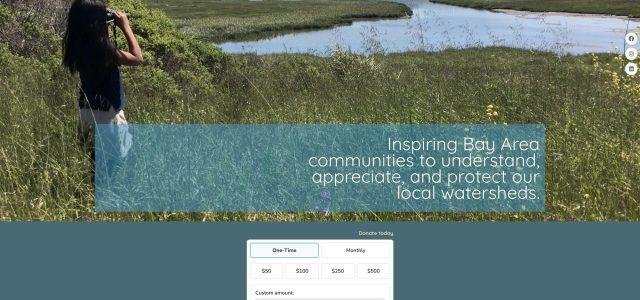
Branding
Logo Design, Visual Identity & Brand Guidelines
A selection of identity work: logos and brand systems designed for organizations across the environmental, peace-building, media and marketing sectors. The most recent and complete engagement is the renewed identity and Brand Guidelines Book for The Watershed Project.
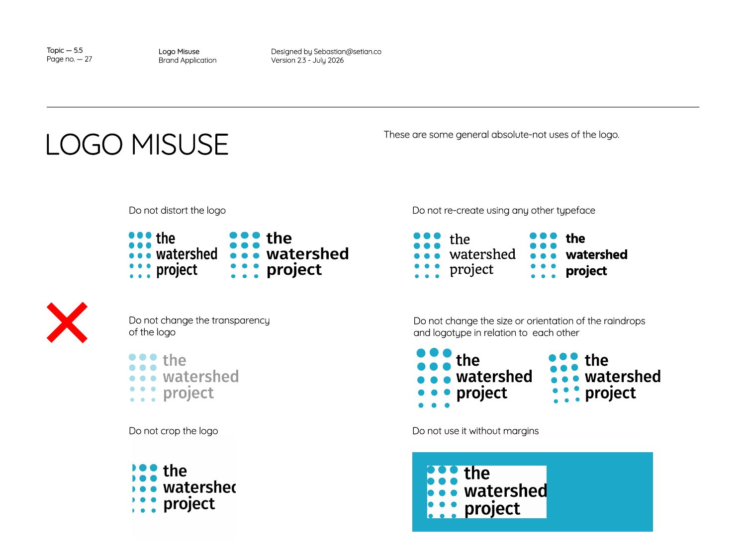
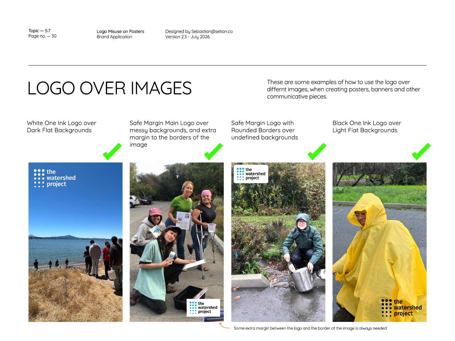
- The Watershed Project: new logo, color system, typography and a 31-page brand guidelines book (v2.3).
- Indepaz: logo for the Institute for Development and Peace Studies.
- Omotio: the original Omotio logo, plus a generative (code-driven) version of the mark.
- KPO Mercadeo y Comunicaciones: logo for the marketing and communications agency.
The Watershed Project — New Logo
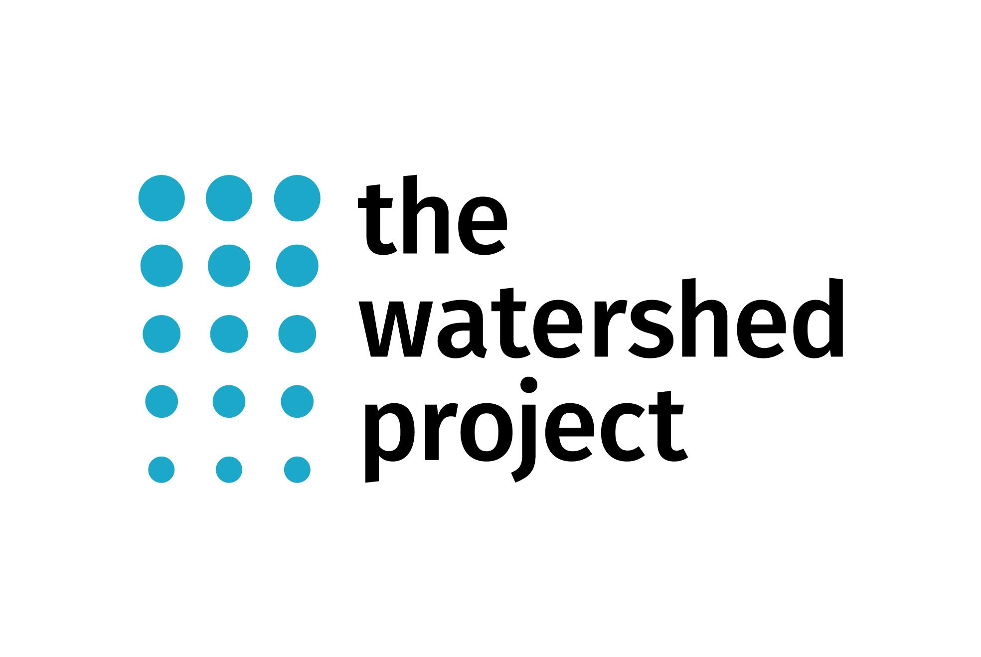
The Watershed Project
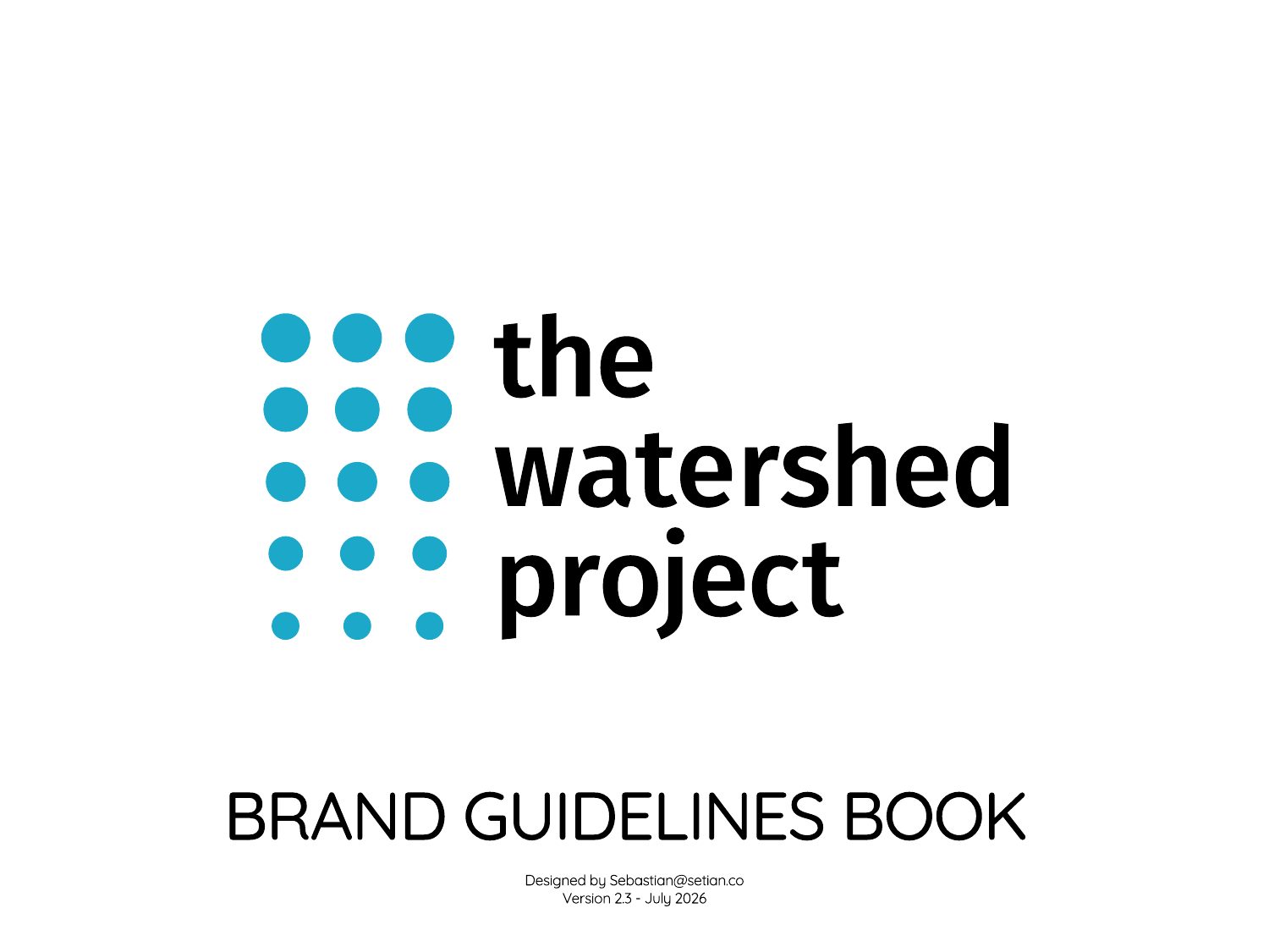
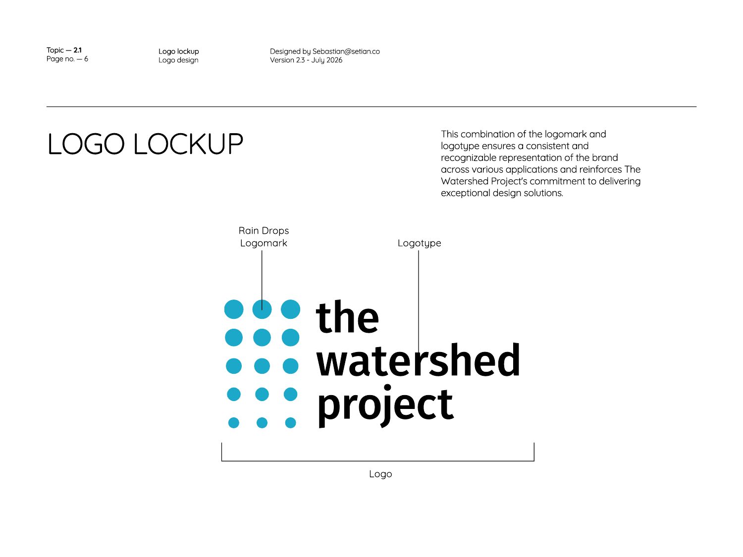
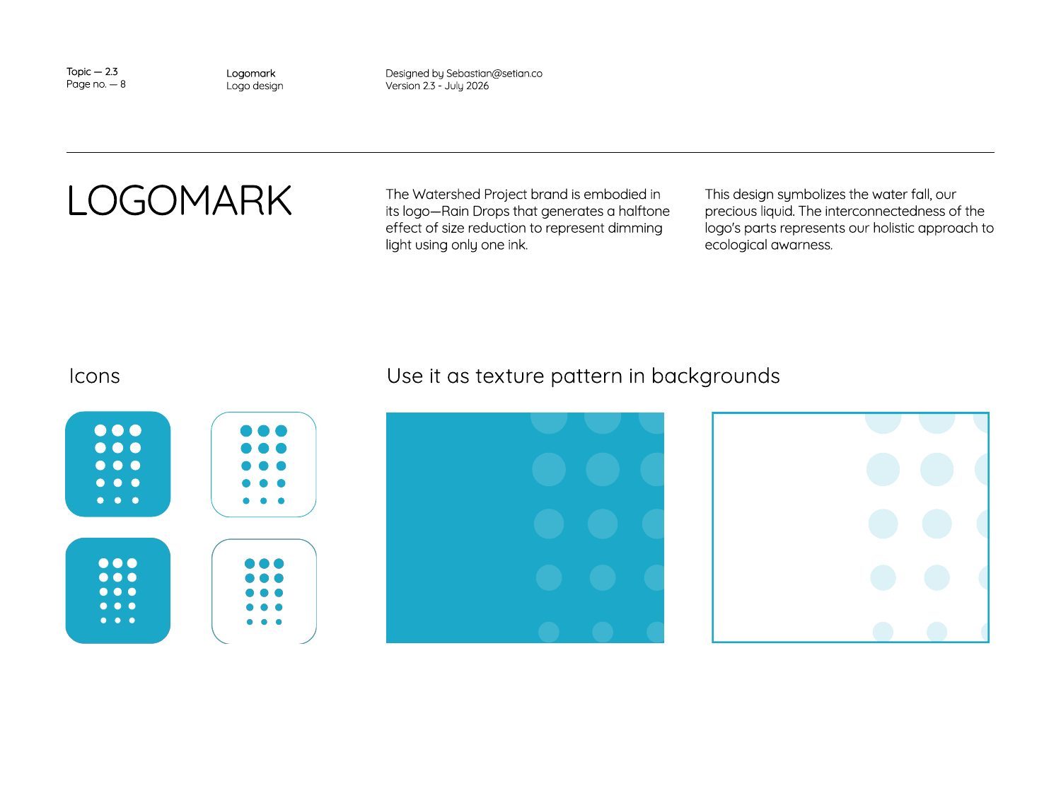
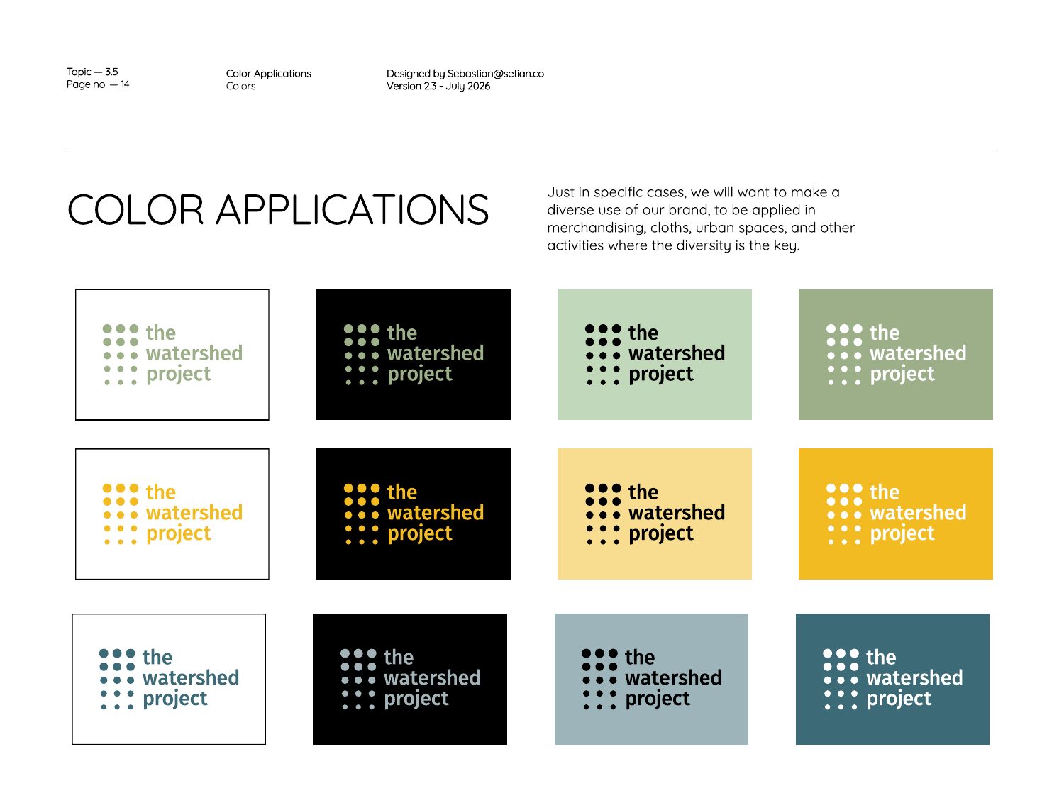
Renewed logo, 2025The “rain drops” logomark: a grid of blue dots that shrink as they fall, reading as water descending through a watershed, locked up with a friendly lowercase wordmark. It is designed to work in full color and in one ink on any background.
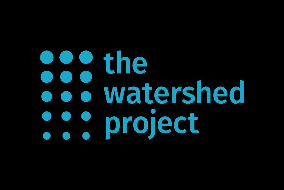
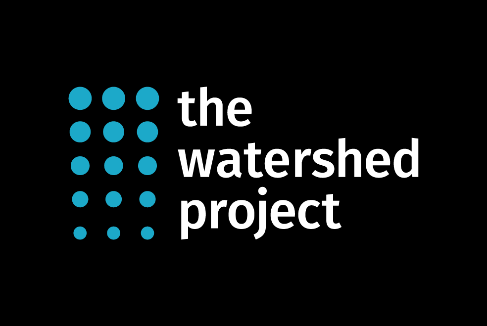
The Watershed Project — Brand Guidelines
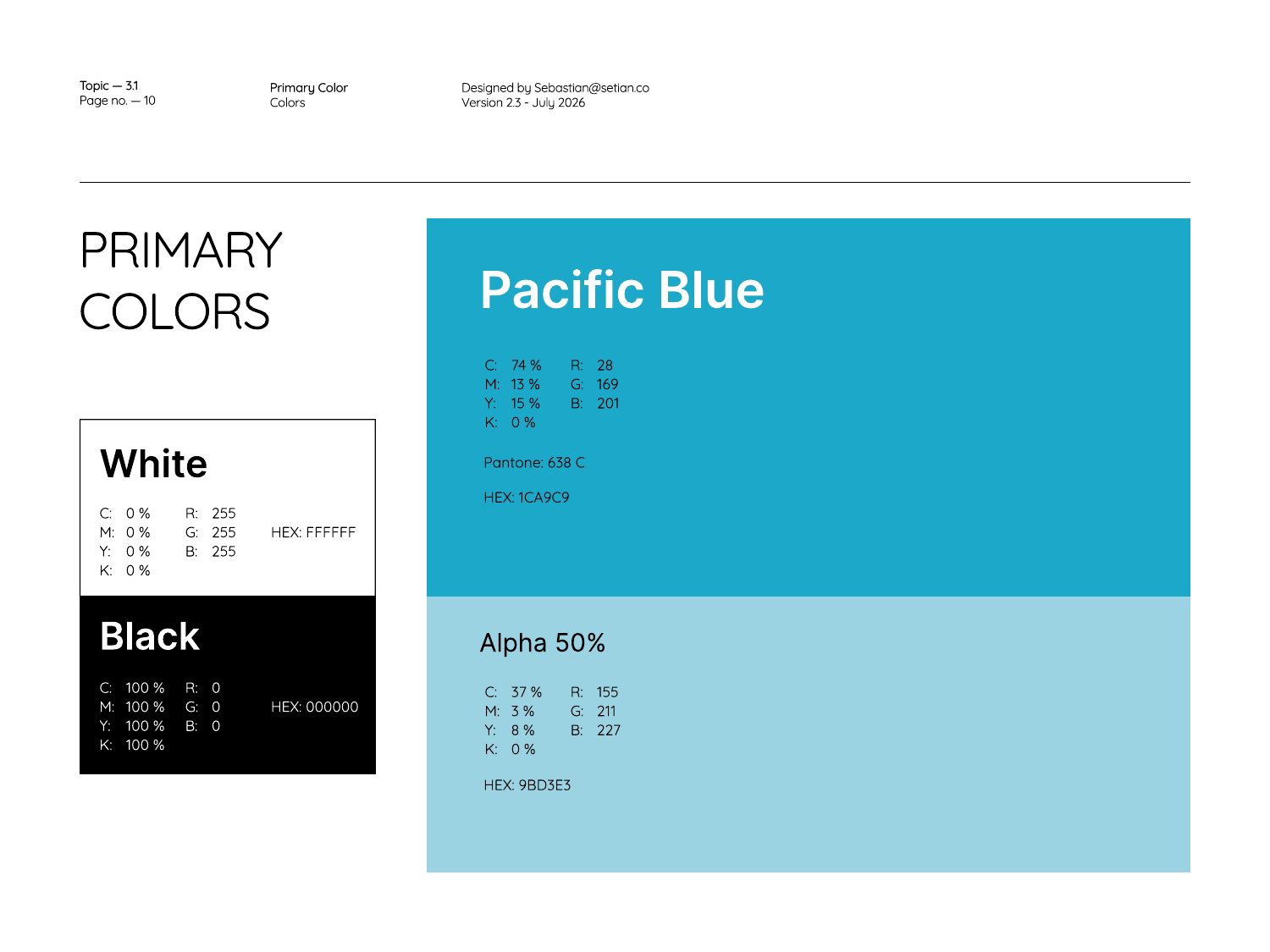
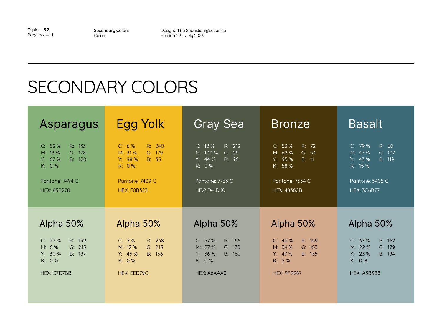
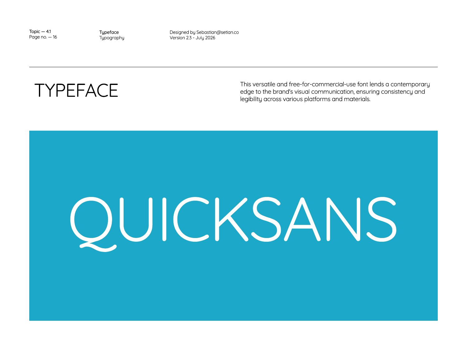
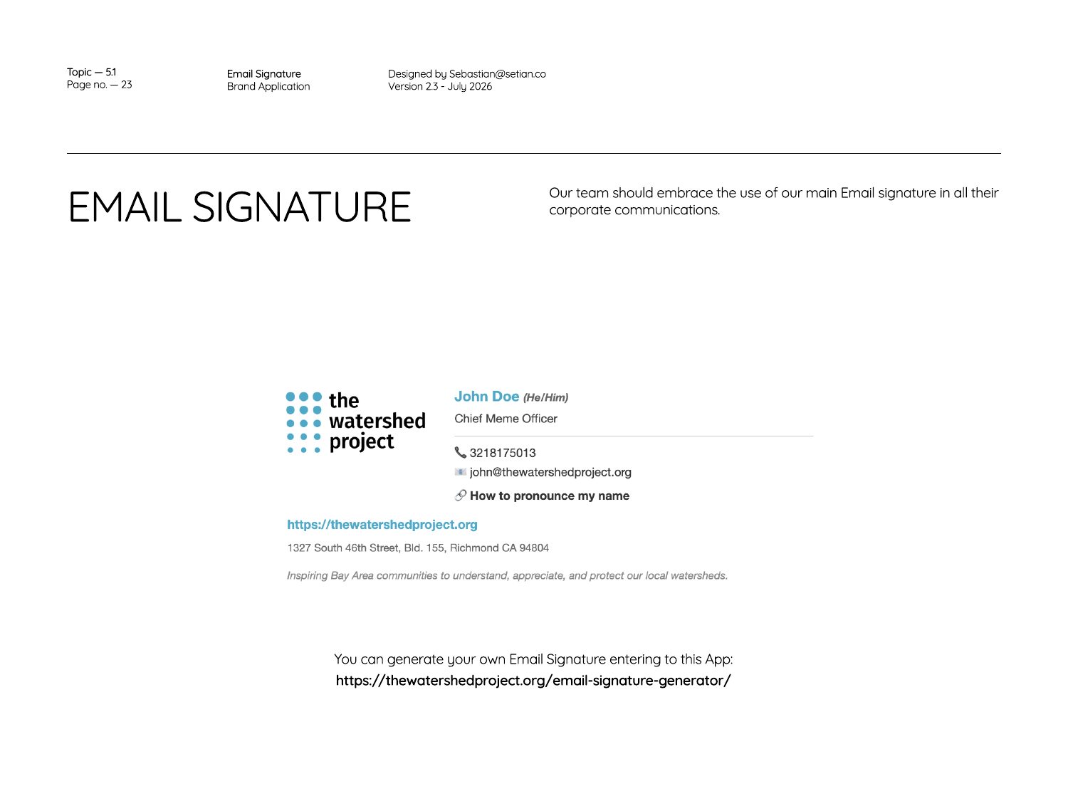
A renewed look for the foundation: the “rain drops” logomark of blue dots that reads as falling water, a wordmark lockup with defined clear space, a Pacific Blue primary palette with five secondary earth tones, Quicksans and Fira Sans typography, and application guidance for email signatures, merchandise, social media and logo use over photography.
More logos
Indepaz
IdentityBrush-stroke ribbon in pink, yellow and blue for the Instituto de Estudios para el Desarrollo y la Paz: a hand-painted mark that feels human rather than institutional, paired with a quiet, lowercase wordmark.
Omotio
Original logoConcentric orange rings drawn with a loose, ink-like stroke: ripples that read as motion and emotion. The original mark for Omotio.
KPO Mercadeo y Comunicaciones
Marketing & communicationsA bold monogram for Salamandras KPO whose “O” is a split blue and orange target, with a light, friendly wordmark above and the service line below.
Simbiosis
Podcast identityPaz y naturaleza. Every letter is built from nature and people: leaves, waves, a figure with open arms and a globe cradled by a dove, in a green, teal and ochre palette. The logo for Indepaz’s podcast.
The team:
Sebastian Gonzalez Dixon / Setian Studio: Logo design, brand identity and brand guidelines